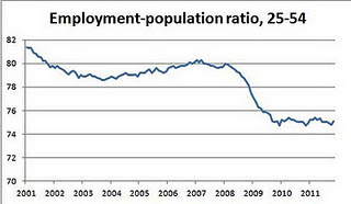
Some of those leaving the workforce are retirees, but the graph to the right is interesting because it shows the decrease from those in prime working ages. This shows how bad the employment is, even beyond the unemployment figures.
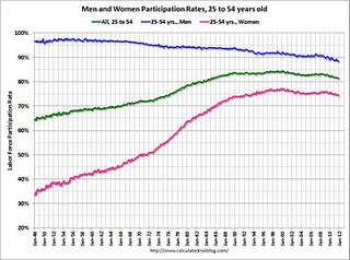
The graph below shows the huge gains women have made in the past 60 years.
CLICK FOR COMMENTS & BIGGER GRAPHS ON THE EMPLOYMENT-POPULATION RATIO


