I’m a big fan of Warren Buffett (as many of you know) as I admire his intellect, drive, and humility. There’s a reason he’s in the top 5 richest in the world.
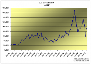
Warren Buffett has a chart that he’s described as his favorite. It’s the total valuation of the stock market versus the Gross National Product of the US.
What is it telling us now? A = Stocks are modestly expensive.
Should you sell everything to cash? A = No. It does, however, tell us to be very cautious going forward and watch the percentage we have allocated to the equity markets.
Do you know what the percentage of your portfolio is exposed? If not, please contact me and I’ll do what I can to help you out.
